Modern Modal Window Design for Web Applications

Well hey there again fellow Sudorealm Coders! You are all welcome to yet another straight to the point tutorial on creating cool UI components for the web.
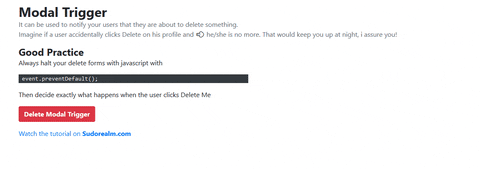
In this tutorial, we are going to be creating a cool Modal Window to notify our users when they decide to delete something!
A simple and very important attention catcher, that every web app needs!

What is a Modal Window?
A modal window is a pop-up div that jumps above everything in the current window to specify an exact functionality.
Modal windows are pretty common around the web, and they serve many purposes.
- Advertisements
- Promotions
- Action Notifiers
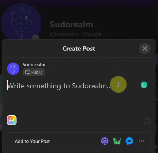
- Or even more complex functionalities like... Creating a new Social media Post.
In a more generic view, they exist for grabbing your attention.
¯\_(ツ)_/¯
For the skilled coder - The Code
The Code in a fiddle! Enjoy!
The Tools:
-
CSS.GG ( I just Used an icon so I only pulled the classes for that, but you can get the whole library in your project easily. )
For the curious starter - The tutorial
This UI component is a pretty easy one to implement, if you are using the Bootstrap Framework you can just copy and paste the example from here on your project and it will be good to go. But the UI is not that good. It's Bootstrapie...
Not that this is a problem, but it is getting really boring when you always interact with the same designs over and over. From a coder's view, it works so why bother, but from a user's point of view, it may even feel like you didn't work enough. I hope you get my point.
I won't stretch this any further. Let's get coding ⌨.
Adding the Bootstrap Framework
This step is so easy that you may already know it, and because I have written about it again in Sudorealm go to **CSS Gradient Cards **and take a look.
Adding the CSS.gg icon
**CSS.gg **is f*ing amazing. If you haven't heard about this before go and check it out now! It's an absolutely free solution for Open-source CSS, SVG, and Figma UI Icons Available in SVG Sprite, styled-components, NPM & API. It's amazeballs yall! 😂
There are many ways to include the icons you want in your project. We only want one icon for this Component so we are going with the markup solution.
First off, go to your CSS file or <style> tag and include the following:
.gg-danger {
box-sizing: border-box;
position: relative;
display: block;
transform: scale(var(--ggs,2)) !important;
width: 20px;
height: 20px;
border: 2px solid;
border-radius: 40px
}
.gg-danger::after,
.gg-danger::before {
content: "";
display: block;
box-sizing: border-box;
position: absolute;
border-radius: 3px;
width: 2px;
background: currentColor;
left: 7px
}
.gg-danger::after {
top: 2px;
height: 8px
}
.gg-danger::before {
height: 2px;
bottom: 2px
}
That's the only CSS we need for our Danger icon from the css.gg library.
Rest of the code
The final code looks like this:
<!--
Bootstrap docs: https://getbootstrap.com/docs
-->
<div class="container">
<div class="mx-auto mt-4">
<a type="submit" id="btn-delete"
data-toggle="modal"
data-target="#deleteModal"
class="btn btn-danger text-white font-weight-bold">
Delete Modal Trigger
</a>
</div>
<div class="modal fade" id="deleteModal"
tabindex="-1" role="dialog"
aria-labelledby="deleteModalLabel"
aria-hidden="true">
<div class="modal-dialog" role="document">
<div class="modal-content">
<div class="modal-header d-flex justify-content-center align-content-center py-5 bg-red-secondary">
<div class="text-center mt-4 w-100">
<i class="slide-in-blurred-top text-danger mx-auto gg-danger mb-2"></i>
<p class="font-main pt-2 text-danger">Are you sure about this action?</p>
</div>
<button type="button" class="close position-absolute" style="top: 5px; right:10px;" data-dismiss="modal" aria-label="Close" >
<span aria-hidden="true">×</span>
</button>
</div>
<div class="modal-body bg-gray pb-0">
<p class="font-weight-bold mb-0 text-center">
Warning! This action can not be undone.
</p>
</div>
<div class="modal-footer bg-gray border-0">
<div class="w-100 text-left px-5">
<p class="text-center">
You are about to delete <br> <span class="font-weight-bold">Your Future</span>
</p>
</div>
<div class="mx-auto">
<button type="button" class="text-center btn btn-danger" data-dismiss="modal">
Nope! Close
</button>
<a type="button" id="form-submit-btn"
class="text-center text-danger pl-3 text-sudo-uppercase ">
Yes! Delete
</a>
</div>
</div>
</div>
</div>
</div>
</div>
Code Review: Inside a container, we get a new div with a link. The link has an id of btn-delete, data-toggle modal, and data-target #deleteModal. These are the key ingredients for triggering a Bootstrap Modal with a link.
The next div is the home of the Modal and it's hidden by default, with a class of modal, and an id of deleteModal, these two are connected with the link above.
To add the finishing touches:
button:active, button:focus {
outline: 0;
border: none;
-moz-outline-style: none;
}

.bg-red-secondary{
background:hsla(0, 100%, 72.9%, 0.1);
}
Just add these remaining custom classes for some dazzle 🎇 and you are pretty much ready to go.
This is what you struggled for!
I find it pretty, simple, straight to the point, and very useful!
Once again The Code in a fiddle!
Meme Checkpoint!

Bonus Section: Preventing Form submission with jquery
Ok cool, you have now implemented this cool minimal modal window in your application, but you still need to halt the delete form functionality and then trigger it again with your new modal.
jQuery to the resque.
$(document).ready(function(){
$('body').on('click', '#btn-delete', function(event) {
event.preventDefault(); //This prevents the form from submiting

$(this).parents('#delete-form').find('#deleteModal').modal('show');

$(this).parents('#delete-form').find('#form-submit-btn').click(function(){
$(this).parents('#delete-form').submit();
});

});
});
</script>
With this little code snippet in your tool belt, you can get a submit button (#btn-delete) to fire the Modal but NOT to submit the form, and then from inside the Modal Window get another button to finally submit the deletion functionality that you want. Pretty basic stuff! 🤓
Final Thoughts
I remember when I was starting with Front End development, beeing a Production and Management Engineer gives a lot of algorithmic knowledge and a pretty solid C, C++ coding background. But no Front End skill whatsoever. So, even simple things like that were a pain in the ass, excuse my french.
These simple tutorials are nothing but a code giveaway for the guy or girl who just wants something different, fresh and easy!
I really love coding, and I also love giving back to the community, so this is just the beginning of a journey for me. Stay Tuned! 📻
If this tutorial helped you send us a message on our Facebook Page we would love to chat with you about anything nerdy, we are the nerdiest realm after all, and if you really really like this type of content why don't like our page while you are at it! 😍
You can show your support by Signing In to the nerdiest realm of the internet
Oh, last but not least! If you are one of those super cool guys that really like to hype people up with crazy acts of kindness
(a really cold espresso is what kickstarts my whole day)
I'd like to thank you for taking the time to read one of my articles, you are the best!
Until the next one, my name is Thanos and I am... OUT 💨