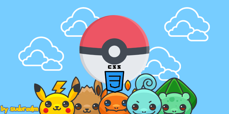
Css Pokeball with Animation
Hello all!! This is my first post about CSS Design! It's not that I am an expert on the matter but I have recently been playing around with some CSS3 animations for a passion project!
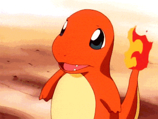
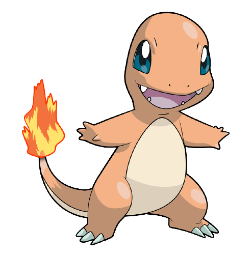
Pokemon has been a passion of mine ever since I realized that I should stop drinking milk from a bottle! I can still remember my first Pokemon!!! (Charmander Master Race).
But I can also remember my first pokemon fight, my first level-up, my first evolution, and my first loss. Oh! also! My first f*ing mental breakdown when I realized that Pokemon Red had lagged right in front of my eyes, I hadn't saved my progress and there was NOTHING I could do about it but to flip the switch off, pull out the cartridge, blow that sucker until my lungs scream for help, put it back in, and start again from where I was 10HOURS AGO! (Real Story).
So you understand that I am not going to let that Poke-Passion go! Thus the decision was made: I will create a CSS animation of a Wiggly low catch rate Pokeball.
🎶🎧 In case you need a Coding Theme for this 🎧🎶
Step One
First of let's set our canvas! For that, I will be using The Bulma CSS Framework in combination with some Custom CSS.
In my Visual Studio configuration, I have included a Bulma Snippets Extension,

and with that extension, I just type bul:html and it expands to a perfect Bulma Html starting page. But if you don't have that you can just copy and paste the Starter Template from the Bulma Website.
Step Two
Sprinkle some flexy CSS on the main body of your .html file:
body{
height:100vh;
background-color:red;
display: flex;
justify-content: center;
align-items: center;
}
What does that snippet do?
- Sets the height of the body to your current Screen Size. 10vh corresponds to 10% of your screen. 100vh to? Yeap! The whole thing!
- Literally does what it says. Sets the background color to red!
- This defines your body as a flex container; inline or block depending on the given value. It enables a flex context for all its direct children.
- Items are centered along the line.
- Items are positioned at the center of the container.
Now, we are ready to create the class that when assigned to a div will center it both horizontally AND vertically on the parent container, in our case the body. This is a big deal people! I have lost count on how many times I searched: "How to vertically align div to parent container". Nowadays that struggle is long gone because of flexbox and CSS Grid. Cool Stuff. 🤓
To the CSS:
.child-to-body{
width: 300px;
height: 400px;
flex-shrink: 0;
}
Now the only line that you might not know is the flex-shrink, this line pretty much tells our div to NOT Shrink! You can play around with other non-negative numbers to see what happens. I am cool with that! Who am I to disagree with you?
Ok, cool! These two CSS rules are the main ingredients for a perfectly center-aligned child div to its parent div.
<body>

<div class="child-to-body box"></div

</body>
I have also included the box Bulma class to make things look a bit more materialized, it adds some background color and shade to our div. And our progress so far is this:

Very good! This beautiful piece of art is the box that will house our Pokeball.
That was the easy part but it's still awesome to know how to center a div inside another div! I feel like it's a must Interview question! I would ask that question immediately!
Step Three
The time has come for our inner Picasso to take over!
#1 Creating the poke box
The poke box is going to be the container of our Pokeball and will set the placement of where the Pokeball is going to be. Since we want our ball to be in a perfect position let's center our poke box.
.poke_box{
position: absolute;
top: 50%;
left: 50%;
-webkit-transform: translate(-50%,-50%);
transform: translate(-50%,-50%);
}
Now the poke_box is centered inside our already centered Bulma box, both Horizontally AND Vertically but in absolute positioning. Everything is going smoothly and we are ready to draw the outline of the Pokeball.
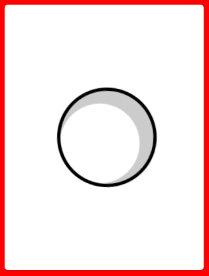
#2 All about the Outline
Nothing difficult with this as well. The main logic is that we create a circle out of a box with border: & border-radius: CSS style properties and then inside our circle, we include a shadow to make it look like a ball.
.pokeball{
position: relative;
width: 150px;
height: 150px;
background: #fff;
border: 5px solid #000;
border-radius: 50%;
overflow: hidden;
box-shadow: inset -10px 10px 0 10px #ccc;
animation: shake 1.25s cubic-bezier(.36,.07,.19,.97) infinite;
animation-play-state: paused;
}
A bit of CSS Explanation: The first six lines create a ball! The overflow property could have been :
overflow: visible | hidden | scroll | auto | inherit
We choose hidden because we want to overflow content to be hidden. Then, box-shadow gives the ball a shadow...
And finally, animation creates the shake CSS animation where wiggles our ball left and right. But you also need to write the rules for the shake animation and then let the animation play infinite times, or do what I did and run the animation on mouse hover 😋
.pokeball:hover{
animation-play-state: running;
}

@keyframes shake {
0 { transform: translate(0, 0) rotate(0); }
20% { transform: translate(-10px, 0) rotate(-20deg); }
30% { transform: translate(10px, 0) rotate(20deg); }
50% { transform: translate(-10px, 0) rotate(-10deg); }
60% { transform: translate(10px, 0) rotate(10deg); }
100% { transform: translate(0, 0) rotate(0); }
}
Output so far :
I'd suggest that you play around with the CSS rules I have given you, to better understand the concept. Change the border color, make the ball bigger, even change the overflow and see what happens.
If you get the hang of it, try creating a GreatBall that would be nice!
#3 The :before and :after of a Pokeball
The :before and :after pseudo-elements in CSS allows you to insert content onto a page without it needing to be in the HTML. While the end result is not actually in the DOM, it appears on the page as if it is, and would essentially be like this :
<div>
::before
<!-- Rest of stuff inside the div -->
::after
</div>
In the following CSS snippet, we set both :before and :after pseudo-elements content to nothing, to create the upper red half of the Pokeball by setting :before pseudo-element to 50% of the size of our Pokeball and giving it a background of red! After that, we draw the middle line of our Pokeball with a simple calculation trick in the :after pseudo-element.
.pokeball::before,
.pokeball::after {
content:"";
position: absolute;
}

.pokeball::before {
background: red;
width: 100%;
height: 50%;
}

.pokeball::after {
top: calc(50% - 5px);
width: 100%;
height: 10px;
background: #000;
}
If you have followed everything to the letter you should be looking at a Pokeball without the middle button!
⚠Warning: the ::before and ::after are not supported by IE8, but the :before and :after are! Do whatever you want! Unless you are on IE8 😱
#4 The Pokeball Button
As the subtitle says the time has come to finish our Pokeball! The last piece of this long poke-puzzle is nothing more than a div with a class of .pokeball_button and by adding it you should be looking at this HTML structure inside your main body of-course:
<div class="box child-to-body">

<div class="poke_box">

<div class="pokeball">

<div class="pokeball__button"></div>

</div>

</div>

</div>
For our middle button we need to first make it a box, then make it a circle, then center it, then give it a shadow to make it look like a Pokeball button! Oh!!! And the make it blink on mouse hover!
.pokeball__button {
position: absolute;
width: 30px;
height: 30px;
border: 4px solid #7f8c8d;
border-radius: 50%;
top: calc(50% - 15px);
left: calc(50% - 15px);
box-shadow: 0 0 0 7px black;
background: #fff;
z-index: 10;
animation: blink .5s alternate infinite;
animation-play-state: paused;
}

.pokeball:hover .pokeball__button{
animation-play-state: running;
}

@keyframes blink {
from { background: #eee;}
to { background: #e74c3c; }
}
On that snippet, you see some new things, maybe! Except for the creation of the Pokeball button I have included a very cool animation that makes the button blink like when a pokemon is inside the Pokeball and you are waiting to see if it will get caught or not! That animation capability from CSS3 fascinates the shit out of me!

That's what we made!
If for some reason you messed up anywhere:
https://github.com/athanstan/css-pokeball.git <--Clone this to CatchEmAll
That was it! A totally functional CSS Pokeball for you to import on any project you like! I really hope that you have gained some knowledge and learned a few new tricks to include in your trickster belt (That was a WoW reference)!
Creative Stop!
If you are a designer and you were like, damn! This post Banner is amazeballs! Then I have some links for you!
- Icons made by Freepik from flaticon.com
- The Sudorealm tag was made by using this cool website 👉 https://fontmeme.com/pokemon-font/
- And finally, the banner came together using canva.com, my favorite program when it comes to blog-post banners and stuff!
🔗Link Drop
- 🐤 Twitter @DevThanos
- [Fb] Facebook
- ☕ BuyMeaCoffee
Support this Nerd
My name is Thanos, my hacker name is d3ad R1nger and I am the only coder behind Sudorealm and an Author. I hack for fun and because is what I really loved as a kid. If you like any of my posts let me know.
You can find me on Twitter @DevThanos. Also, you can show your support by Becoming a Member of the nerdiest realm of the internet and Follow the Hacking Category or leave a 👍 on Sudorealm on Facebook
Oh, last but not least! If you are one of those super cool guys that really like to hype people up with crazy acts of kindness And keep the Hacking Spirit awake.
That is if you find my articles interesting and want more! (a really cold espresso is what kickstarts my whole day)
💸 We also provide Cool things for you, related to our articles in the Affiliate Section take a look! That's it for now! I really want to say thank you again I'll keep these posts coming. Happy hacking, and stay out of trouble! 🤓😏
Man that post was quite a big one, even Charmander evolved 🔥🔥🔥